After having looked at the history of digital map design in general in the first part of this short series and at the current situation of map design in OpenStreetMap in the second part, i am now, in this last part, going to specifically look at what the OpenStreetMap Foundation seems to be pursuing in that field at the moment and in what direction that is likely going to go.
The OSMF’s history in providing maps
The OSMF has for some time followed a quite erratic course with regards to rendering and providing maps for the OSM community. Historically, a significant percentage of the OSMFs IT resources have gone into rendering the standard map layer on openstreetmap.org. And while there has been discussion and ultimately a policy was developed on who is allowed to use that tile service under what conditions, the OSMF has never really stated a clear purpose for that tile service or the conditions for choosing OpenStreetMap Carto as the style for it. There is a set of requirements for tile layers to be included on osm.org – which are mostly hosted externally – but nothing to this date defines what qualifies OSM-Carto to be the style the OSMF invests substantial resource in to render as a map. I have, as an OSM-Carto maintainer, repeatedly criticized this omission, because it also means the OSMF takes no responsibility for the decision to do that.
Back in 2021 a poll the OSMF board made of the OSM community included the question about the future of map services provided by the OSMF, for the first time indicating to the OSM community that they are contemplating making changes in that field. The question was very vague and ill-defined (which i criticized back then) and the answers were accordingly inconclusive. The term vector tiles had already become a magic word back then without much of a well defined meaning but where everyone seemed to project their hopes and dreams into.
Later that year the OSMF announced that they would – on the operational level – do some testing in that field. But even upon inquiry no overall strategy was mentioned this initiative would be part of and it became clear that this was an initiative from operations and not part of a larger strategy of the OSMF at that time. The interesting part here is that, while this announcement was only about a relatively small operational investment into testing with nothing in terms of money being involved at all, there were quite immediate reactions from economically interested parties substantially lobbying for their pet frameworks being considered by the OSMF as well.
Long story short: Back in 2021 it was clear that (a) the OSMF had no substantial strategy for the future of the map services provided by the OSMF, (b) there were already a lot of people projecting their hopes into the vague concept of vector tiles and loudly calling for the OSMF to make these hopes to magically come true while the whole matter became further political because economically interested parties began to see the chance to profit and started lobbying the OSMF to adjust plans in their favor – and (c) that actual map design was not going to play even the most marginal role in the whole process. After that there was not much publicly visible progress for some time. The strategic plan decided on in July 2021 included only a development platform for vector tiles by volunteers – which seems to reflect the board’s reading of the survey results back at that time to leave that to the community to pursue.
Something changed at some point in 2022. In November there was a short mentioning of the matter in one of the meeting minutes. From then on a fairly remarkable timeline in discussions and decisions can be reconstructed from the minutes that paints quite a rich tapestry of the inner workings of the OSMF. Although this is of little relevance for the topic of this blog post i highly recommend taking the time to read through all of that.
- November 2022
- February 2023
- April 2023
- May 2023
- June 2023
- July 2023: part 1 part 2
- September 2023: part 1 part 2 part 3
- November 2023
- December 2023: All Decisions of the 2023-12-11 meeting have been redacted – including the actual money spending decision of EUR 40k, short summary can be found in the minutes list. Note that – among other things – the meeting happened during the 2023 board election and discussed matters pertaining to the fitness for office of one of the board candidates in that election.
- January 2024
The meaningful information w.r.t. the topic of this post is that, when the OSMF contracted Paul Norman to do the work that these days seems to be coming to an end, they still apparently did not actually have a strategy on their own regarding the OSMF’s map services. And it is unclear if they have de facto adopted what Paul sketched in his proposal (published here, which is rather vague in terms of strategic goals) as the OSMF’s de facto strategy or if they have meanwhile developed some other kind of plan. What is, however, quite self evident is that they will certainly want to roll out the results of spending EUR 42k in some form. And this is what i will base the following considerations on, i am not making any further assumptions beyond that.
The map serving process
What i am going to do here is discussing what that likely means for the OSM community. To explain that, here first how the current setup of the standard tile layer on openstreetmap.org is run (based on OSM-Carto):
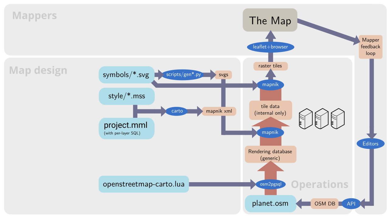
The practical map rendering process and mapper feedback loop with OSM-Carto (or similar styles) – link goes to larger version
I illustrated which parts of this setup are controlled by who: The gray rectangle titled Map design is controlled by the OSM-Carto map designers and maintainers. The Mappers using the map decide which parts to view and what to map and the OSMF (Operations) is in control of the OSM database and the map rendering chain until the rendered tiles are delivered to the map user. Some might be irritated because i split up the rendering process with the tile data (internal only) to make the process better comparable to the vector tiles one shown below. This split is not visible to operations, it exists only internally in Mapnik. It is, however, visible to the map designer who separately designs the query to generate the tile data and the rules to draw the tile from this data as formulated in the CartoCSS code.
The important thing to note is that the rendering database in case of OSM-Carto is deliberately kept generic. This allows you to render several completely different styles from the same database, to make almost any style changes without reloading the rendering database and it also simplifies systematically testing the style as a whole because the database import does not need to be part of this testing.
In case of OSM-Carto the processes within the map design domain are relatively simple. For comparison: Here is how this looks like with the Alternative Colors style.
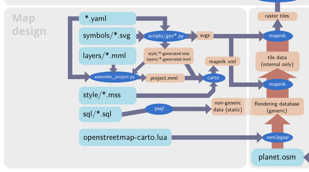
Differences with a more complex style like the AC-Style – link goes to larger version
Like a lot of other map styles the AC-Style extends the rendering database with some style specific data. In my case this is some SQL functions, mostly for tag interpretation and geometric processing, and the tree symbology (which needs to be in the database to work around limitations in Mapnik – see the blog post discussing tree rendering). But this is static data, it does not change when the main database content changes.
Here is now how the whole process would change if Paul’s work would be rolled out as developed (based on my understanding from what has been communicated – i have not actually tested this setup myself).

The expected map rendering process and mapper feedback loop with minutely updated vector tiles (as currently pursued by the OSMF) – link goes to larger version
From the operational side this means – in a nutshell – that the last part of the traditional rendering chain as shown for OSM-Carto above is cut off and outsourced to the map user. This substantially reduces the resources required for serving the tiles and at the same time allows customizing the actual rendering of the tiles without this requiring additional resources.
That is – in short – the whole magic of vector tiles. In reality it is of course not all that simple – for multiple reasons.
First: For the outsourcing of rendering to the map viewer to work you need to massively reduce the volume of data transferred and involved in rendering. In the diagrams shown i indicated high volume data with the wide red arrows. And the tile data internally processed by Mapnik is typically even substantially larger volume than what is in the rendering database (which tends to be many hundred GB for a full planet import) because the queries do geometry processing that frequently adds data volume. In case of the client side rendered vector tiles this volume needs to be massively boiled down with the help of lossy data compression. And despite these efforts (and their negative side effects) the bandwidth requirements for viewing one of these styles is usually much higher than for a traditional raster tile based map.
Second: The rendering database is not generic any more. That is not inevitable but practically i am not aware of any client side rendered vector tile setup that uses a generic rendering database.
Third: Map design as a domain in control of parts of the whole process is gone. That requires a more detailed discussion of course.
Above, i explained that one of the main promises of client side rendered vector tiles is, that the actual rendering can be customized for every map viewer. But the ability to customize the actual rendering does not mean that you can fully customize the map design. In reality, most of the map design decisions are implemented in the vector tile generation, partly because of the need to keep the tile sizes small. This means that everything that is not necessary for the specific map design chosen needs to be stripped from the data. Or seen the other way round: Trying to introduce any level of map design genericity into client side rendered vector tiles will often have massive impact on bandwidth requirements.
Practically, all client side rendered maps i have seen so far have a division between the people/organization in control of the vector tile generation and those developing the client side part of the map design (which i labeled style design in the diagram). And the vector tile generation furthermore tends to be under control of software developers and not map designers – hence i labeled that part software development. In the setup Paul has developed this part is further split into multiple components under control of different people.
What this means is that map designers would, in such a setup, get marginalized to mere style designers who can play a bit with colors and line width selection and designing point symbols. The real control over map design would sit with the software developers in control of schema and vector tile production, whose main concern is not going to be map design but operational efficiency and keeping the size of the vector tiles small – the technocratic direction as i described it in my discussion of OSM-Carto. Theoretically, you could argue, you could put the style designers hierarchically on top of the software developers in control of the vector tile schema and require the latter to adhere to the wishes of the former. But in today’s OSMF this has zero chance to happen as evidenced by the fact that map design aspects played no role at all in the whole process of developing this setup. As i wrote in the discussion of OSM-Carto, the only way from my perspective for sustainable progress in map design would be to bring the technocratic and the artistic direction together in a single cooperative project with clear common goals everyone subscribes to.
Beyond the magic
So what remains of the magic of vector tiles and its promises in light of this? The lower resource requirements for operating a tile server are indeed there. But only if you look at it purely from the micro-economic perspective of the tile server operator. From a macro-economic perspective the resource requirements are actually higher in sum because the actual rendering is done separately for every map user. Client side vector tiles is not Tiles@home.
But don’t get me wrong, there are of course benefits of client side rendered maps. One major one is the ability to implement more interactive maps based on the semantic data transferred to the client. And if you invest the bandwidth to include additional data in the tiles, customizing the map can be a real benefit. But there is no magic here, this all comes with costs.
The real question, however, is, what this means for map design. If i put aside the organizational division between style design and vector tiles generation for the moment what remains is what changes if you design for a client side renderer compared to a Mapnik based rendering chain. There are still several really big issues i am afraid. I already explained those in more detail in my post on what rule based map design requires from the tools it uses.
But now comes the twist some readers probably don’t expect: All of this does not mean the OSMF did something wrong by investing into implementing a toolchain for minutely updated vector tiles. Of course apart from the board epically failing in the procurement process for this on so many different levels. If i ignore that for the moment then investing in this is a completely sound decision. Client side rendered vector tiles are – independent of their practical relevance for the OSM community – currently the main technique for producing interactive web maps used by commercial map providers. And these commercial actors, while having invested substantially in the toolchains for this style of map production, have very little interest in minutely updates. These are a relatively unique interest of the OSM community. Hence it is a reasonable idea that the OSMF should chime in to serve this specific need.
If the OSMF now feels that this reasoning is not sufficient to justify the project and feels instead the need to roll out a cheaply thrown together postmodern OpenMapTiles/Mapbox clone with minutely updates as the main map on openstreetmap.org that would be regrettable. But it would not really mean much in the grand scheme of things. It would surely not solve the structural problems in practical map design in and around the OSM community that i explained in the previous post.


