

Satellite images and their use have become much more popular in recent years. There was already an earlier wave of broader popularization of satellite imagery with image layers being widely introduced in popular map services on the internet between about 2005 and 2010. This for the first time exposed a large number of people to satellite imagery as a source of information and spatial orientation and not just as mere anecdotal photographs.
What i am talking about here however is the more recent trend of the past roughly five years – so about ten years after the first wave. In contrast to the first wave which was primarily about casual use of imagery this second wave of popularization of satellite imagery involves in particular also more serious or semi-serious active use of satellite data by both professionals and hobbyists with diverse (and often not image processing and not earth observation related) backgrounds. Driving this recent trend is in particular the advertisement and PR which satellite operations – both private businesses and public institutions – invest to create interest in the use of their data and services. This combines with many providers of cloud based services trying to attract paying customers for use cases involving satellite data.
Some might disagree with me identifying these two distinct waves of popularization and instead would see a continuous trend. But i see a distinct period of stagnation in popularization between these two phases and i have been actively observing the field over the whole period so i think i have a pretty good read of it.
Anyway – what i want to write about here is not so much these waves of popularization of satellite imagery but how quality of satellite image based visualizations has developed during this. The technical quality of satellites’ image sensors has improved massively over the years – i have written about many examples showing this. Interestingly this trend in satellites is paralleled by a similar (and technologically related) trend in ground based digital photographic technology as well as its use. To illustrate the point i want to make about satellite image visualization i will therefore make a quick excursion into the development of digital photography over about the same time period.
Since the beginning of mainstream digital photography in the late 1990s sensor and camera technology have seen a similar quality development as satellite image sensors. And the use of the image data produced by these cameras has seen a similar development. With that i am not talking about exotic methods employed by a small elite of experts, i am talking about mainstream image processing methods available to and used by many photographers. Based on this development both in sensor and camera technology as well as in processing methodology even a cheap mobile phone camera will produce images out of the box that would have made a professional photographer of the early 2000s using the most state-of-the-art equipment envious. And with some rudimentary learning and training in use of broadly available tools and techniques (either in-camera or in post processing) you can easily improve in the quality of ground level photographic data visualization if you want so far beyond that.
Example of the technical level of the quality of ~2005 consumer digital camera technology with low dynamic range, high noise levels and poor color depiction

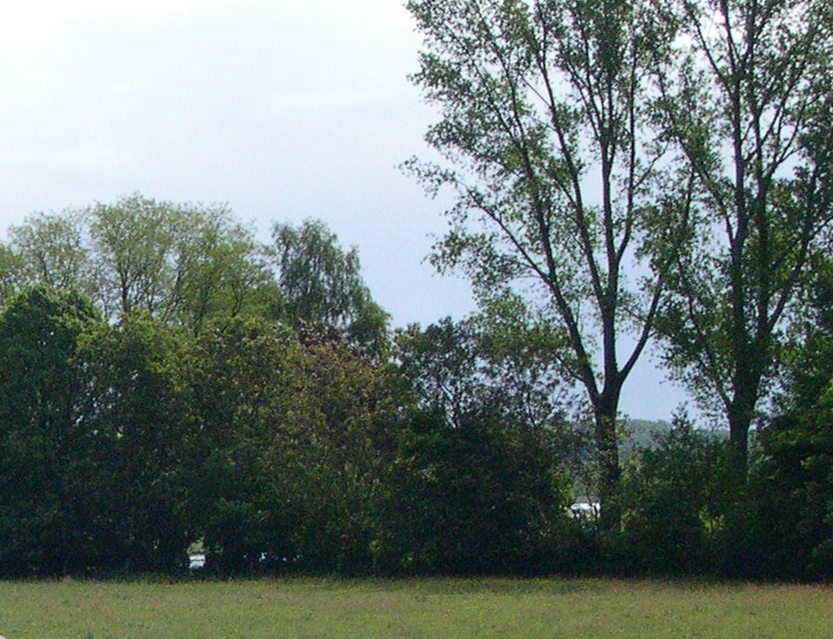
Out-of-the-box results from a present day (2020 model) mobile phone builtin camera showing excellent dynamic range and low noise, very decent color rendition (which can be much improved on with larger image sensors available these days) and an equally decent automated visualization for an sRGB color screen
Getting back to satellite images now – as said the technical development in satellites’ camera technology pretty much reflects the sensor and camera technology development in ground level cameras. But in data processing and visualization technology employed in broad popular use it does not. Since at least the start of Landsat 8 in 2013 – which marked a significant step up in quality of open data imagery available in larger volume – i have been amazed by the stagnation and sometimes even decline of technology and sophistication in processing methods in the visualization of satellite image data. I have written about this previously in a specific case which – through non-sophisticated processing in visualization – excessively undervalued the quality of the image data used. But this is just a single case example of a much broader phenomenon.

Mediocre quality visualization with clipped colors underselling the much better underlying image data
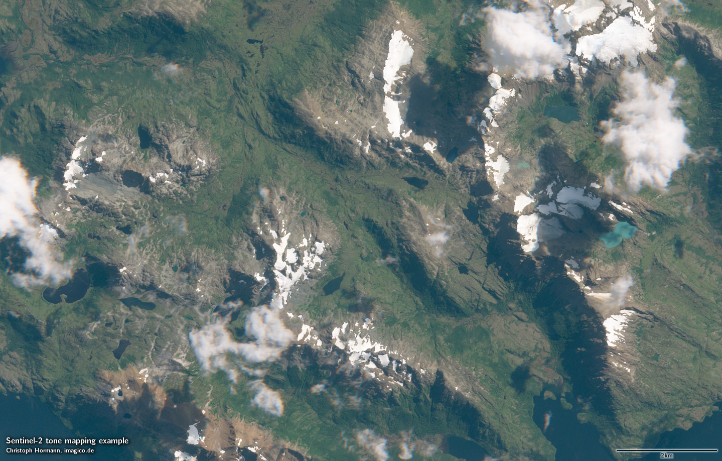
Better visualization of the same data
The amazing thing is that this is evidently not a problem of missing innovation because the innovations not used that would be of value to produce much better visualizations have already been developed and are broadly used – in the domain of ground level photography.
A large fraction of the many people working with satellite image data these days and proudly presenting visualizations of such as testimony to their expertise in the domain work without making use of some of the most basic technological and methodological innovations that have been developed for digital image data visualization over the past decade in photography and that are now available routinely in every phone.
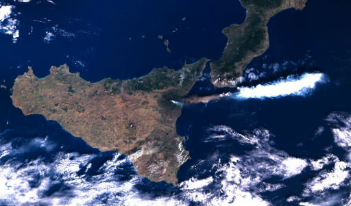
Poor visualization of recent Etna activities from Sentinel-3 OLCI data with distorted colors and unnatural color clipping
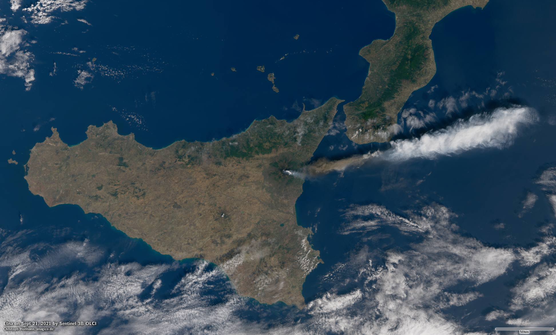
More consistent visualization of the dame data giving a more balanced and more accurate impression of the setting
So in a way you could for many of the mediocre visualizations you can see these days both on social media and more serious channels essentially comment: The 1990s called, they want their crappy, distorted colors and overexposed JPEGs back.
As for the reasons for the described phenomenon – a huge part of that is probably because people predominantly do not view satellite images as photos but as a more abstract type of depiction.
The reason why even in the most low end sectors of the digital photography market we have over the past two decades essentially had a continuous competitive pressure for improvements in technical quality is because users of these devices and related software assess and judge quality and are able to do so through comparison with their direct personal visual experience. That is not the case with satellite images. To put it very simply: People tend to expect upfront that satellite image visualizations in many ways do not match or are consistent with their personal viewing experience of the areas shown on the images. Therefore they are more inclined to accept badly made visualizations of satellite images.
That does not mean people are unable to appreciate quality in satellite image data visualizations if they are confronted with the difference like in the examples above. So in a way by aiming for excellence in visualization of satellite imagery you show respect for the needs of your recipients without requiring them to articulate those needs as demands.