One of the pitfalls when OpenStreetMap contributors map remotely based on aerial or satellite images without recent on-the-ground knowledge is that it sometimes leads to “improving” seemingly inaccurate data based on outdated information. The most iconic examples for this are cases where buildings have been demolished but remain visible in popular image sources and mappers keep recreating these buildings because they seem to be missing in the OpenStreetMap database.
The whole problem has increased in recent years because the number of different image sources being used as a data source for mapping has increased a lot and at the same time the average age of image sources tends to increase because images are not always updated in regular intervals. Quality of imagery is ultimately a multi-dimensional measure but to mappers, especially if they are unfamiliar with the area they look at, image resolution is the most observable dimension of quality and often mappers are inclined to consider the highest resolution image source as the best one. The most important dimensions of image quality probably are:
- spatial resolution
- positional accuracy – which is not necessarily correlated with resolution – see my post on the subject.
- age – lack of consideration for this is the cause of the problem described above.
- seasonality – images from different seasons often have different suitability for mapping different things. A frequent problem of high resolution images from Bing and DigitalGlobe at higher latitudes for example is that images are often from early in the year (where weather is frequently better than later) and most things you’d want to map are hidden by snow.
- cloud freeness
Human made infrastructure is not the only situation where the combination of these different dimensions of quality for a certain mapping task leads to the highest resolution image source clearly not being the best. I recently came across a great example to illustrate this.
Background story: Back in 2013 i mapped the glaciers of New Guinea in OpenStreetMap based on then new Landsat imagery. Bing did not back then and still does not offer any useful imagery in the area.
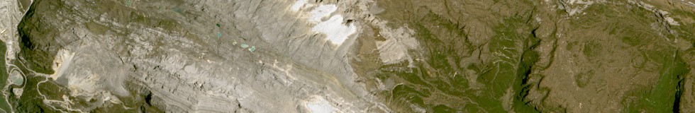
With the recently released DigitalGlobe image layers there is now high resolution coverage of this but images are not very new, likely from around 2011-2012. More importantly though the Northwall Firn area has a significant offset. Which leads to the new mapping made by palimpadum made in good faith to actually be less accurate than before.

I put up two new images on the OSM images for mapping now which can help actually updating and improving the glaciers and possibly other thing in the area. These images also well illustrate the other dimensions of image quality for mapping.
The newer of the two images is from 2016 by Sentinel-2. It features the most recent cloud free open data image of the area currently available. But it has a serious flaw: It features fresh snow on the highest areas of the mountains making accurate mapping of the glaciers based on this impossible.
The other image is from 2015 by Landsat 8 and shows the glaciers free of fresh snow so you can well see their extent. So overall we have:
- The DigitalGlobe image which offers the highest resolution but is the least up-to-date and has at least in small parts a fairly bad positional accuracy. Also large parts are not usable due to clouds.
- The Sentinel-2 image which is the most up-to-date but is impaired by fresh snow.
- The Landsat 8 image which is slightly lower resolution than that of Sentinel-2 but offers a snow free view of the glaciers.
Positional accuracy of the Sentinel-2 and Landsat images is very similar in the area by the way. And finally clouds are also the reason why we have no newer images from either Landsat or Sentinel-2 that offer a clear view of the area.
For mapping the glaciers you would want to use the Landsat image here of course. For mapping the mine which tends to change quite rapidly the Sentinel-2 image is probably best. Other things like lakes or landcover can be safely mapped from the DigitalGlobe data although it is a good idea check and possibly correct image alignment using the Landsat and Sentinel-2 data as reference.
Even to those who are not really interested in glacier mapping i would recommend loading the three image sources in your favorite OSM editor and switch between the different images a bit to get a feeling for the differences described. Here the URLs for the OSMIM layers:
tms:http://imagico.de/map/osmim_tiles.php?layer=S2A_R088_S05_20160812T011732&z={zoom}&x={x}&y={-y}

tms:http://imagico.de/map/osmim_tiles.php?layer=LC81030632015286LGN00&z={zoom}&x={x}&y={-y}