

The State of the Map conference of 2020 has recently published two logo designs for T-shirts and stickers and i want to have a few comments on cartography and design of those here.
Although i don’t know when these designs have been originally developed they seem to kind of reflect the overall weirdness of the virtualized conference which – while the conference being completely non-physical – tries to maintain the impression and the characteristics of a localized physical event as much as possible and unfortunately IMO also retaining much of the exclusivity of a conference where the costs of participation for the average visitor would have been in the order of EUR 1000 or more. While the virtual conference is open for participation as visitors to anyone without charge the main program consists of talks only by people who were originally willing and able to travel to South Africa for that purpose. But that is subject for a different blog post. This one is about cartography.
The designs developed for the conference you can find here (developed by Bernelle Verster, CC-BY-SA 4.0):
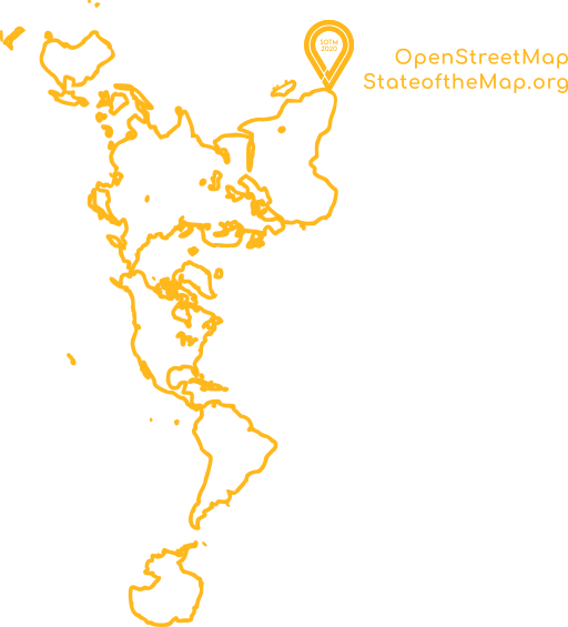
official SotM 2020 T-shirt design

official SotM 2020 sticker design
The map projections
First of all it is refreshing to see that neither of these show a mercator map. That is promising and admirable considering the overwhelming dominance of the Mercator projection in the OpenStreetMap world where Earth is essentially a square and the vast majority of people who produce maps and the vast majority of OSM specific data processing tools for map production know nothing else.
So what map projections have been chosen here? The first one uses the Dymaxion or Airocean projection. This is a variant of the class of icosahedral projections which map the approximately spherical surface of Earth to an icosahedron and then cut this open in some fashion to create a flat map.
generic icosahedron projection
The Dymaxion projection is somewhat more complex than plain icosahedral projections because it in some cases does not only cut along the edges of the icosahedron but through the faces. Combined with an optimized rotation of the icosahedron this allows a continuous display of the land masses of Earth with no larger land areas being cut and the rather limited distortion of mapping the spherical surface to the icosahedron faces leads to a overall very low distortion map.
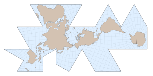
the Dymaxion projection
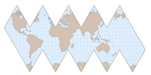
This projection also has a different distinctive property – it is an interrupted projection, meaning it has an edge far longer than half the circumference of the earth. There are other, more common interrupted projection like the following.
Example of other interrupted projection
The advantage of the interruptions is that they allow the map to combine low scale and shape distortions within the non-interrupted parts of the map. They however have the disadvantage of being completely unable to properly represent relationships across the interruptions. In case of the Dymaxion projection the interruptions are placed over the ocean and as long as the map user is only interested in land areas this is fine. Things like the proximity of Africa and South America across the Atlantic Ocean however are not properly represented.
Another property of this projection is that there is no alignment whatsoever to the earth rotational axis. Some consider this an advantage claiming the Earth is spherical and without any direction having particular significance. This however neglects the fact that the rotation of the Earth is of fundamental importance for the planet and a map projection where this is not taken into account is poorly suited to illustrate climate zones or other phenomena related to the Earth rotation.
For a South Africa conference logo this map projection is an interesting choice because South Africa is located at the far periphery of the Dymaxion map – opposite to the main axis of the map formed by the Pacific Ocean rim. I am not sure if this was a conscious choice of the designers but in a way the Dymaxion map very prominently celebrates the unique position of southern Africa on Earth.
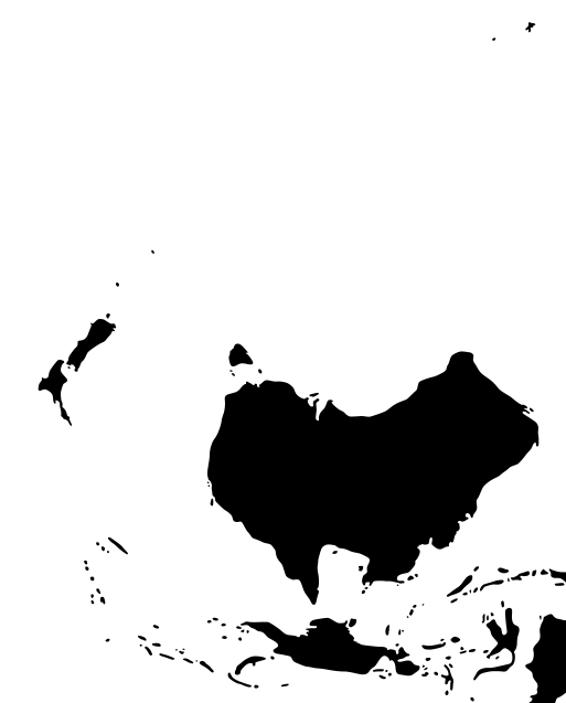
There are a number of peculiarities in the actual image of the T-shirt design. One is a phantom island in the Pacific Ocean west of the Galapagos Island which does not exist in the real world. The other is the incorrect location of Kerguelen Island ad the upper edge of the map only about half the distance from Australia compared to its actual location.
The sticker design in a way goes into a completely different direction and uses an orthographic map projection with southern Africa at its center. This essentially is the appearance of the Earth from infinitely far away above this location. It shows half of the planet only obviously – which might make people from North America especially uncomfortable possibly.
As an additional quirk it uses approximately a south up orientation – which positions the Antarctic approximately where the logo covers the map.
Generalization pitfalls
The sticker map brings me also to the second topic of this post – the cartographic generalization pitfalls of designing maps like this. The problem you are dealing with here is that for a T-shirt or a sticker you do not want an excessive amount of detail, you want a clear map where the shapes of the geography are well recognizable. This is a standard task of cartographic generalization but unfortunately maps like this are rarely made by actual cartographers. The most obvious problems with the generalization used are that the Red Sea, the Mediterranean Sea and the Black Sea are degraded to lakes in the Sticker design. That is a big no-no in cartography (although we see this also in interactive online maps which are often designed by software developers which unfortunately often leads to a neglect of the cartographic side of things).
One other issue – which is unfortunately also fairly common in other small scale maps – is the inconsistency in what islands are shown and not shown on the map. The Dymaxion map displays Hawaii, Galapagos and even the South Orkney Islands but neither the Falkland Islands or the Lesser Sunda Islands or New Caledonia.
Neither of the maps probably use OpenStreetMap data as a basis – which is a bit ironic for an OpenStreetMap conference of course. They even seem to use a different data basis which is visible in the Antarctic where the Dymaxion map misses the Ross Ice Shelf but includes the Filchner–Ronne Ice Shelf while in the sticker map it is exactly the other way round. I hope this illustrates that taking care in data source selection and using accurate data of known and consistent quality is not something you can simply forgo when doing small scale illustrations. Though common practice already in pre-digital times picking a possibly decades old data set of unknown provenance out of convenience because it has already been preprocessed for your needs is rarely a good idea and often leads to replicating errors.

inconsistent rendering of the Antarctic in both maps
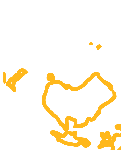
To demonstrate that and how these issues can be improved upon i prepared alternative versions of both designs. You can see and download them below. All of them are under CC-BY-SA like the original designs. Using ODbL OpenStreetMap data.
The projection of the sticker map is – although very similar – not completely identical and i produced different variations of the T-shirt design with different generalization levels and rendering styles of the coastline. Further individualization is encouraged.
I hope both the discussion of the issues with the maps in these designs and the demonstration of improvements to those help designers producing such illustrations understand better how quality cartographic work is at the core of any quality graphics design work involving maps. And maybe the few examples discussed here provide the interested reader a somewhat better idea of what constitutes quality in cartography in particular at small scales.

Sticker design with better generalization of the coastline based on OSM data (SVG)

Just the map without logo and text

T-shirt design with improved generalization – low detail version (SVG)

T-shirt design with improved generalization – high detail version (SVG)

T-shirt design with improved generalization – filled color version (SVG)
These are of course also examples of the map design and cartographic data generalization work that i am offering – if you have need for such services you are welcome to contact me about that.
July 6, 2020 at 15:10
Thank you for this post. It is a real pity your contribution did not make it to the shirt designs in time for printing. Especially the filled high detail version is absolutely stunning.
I found the comments about the projection most interesting, thank you.
Some clarifying comments:
The designs were loaded onto the website on 12 June 2020. They were designed under time constraints and I have neither cartography nor graphic designer skills. They were licensed in a way to be able to be improved upon. I helped to organise SotM2020 to learn more about all things map related, and one of those fantastic finds is your website.
Prior to 12 June, from about 5 May onwards when I was still asking for design input (multiple times), I conversed with the SotM community on Telegram, which was the most active relevant group I could find. I had a delightful day on 20 May learning about all the projections, with a generous sidetrack on how a flat earth would actually look. The xkcd comic on Map Projections (https://xkcd.com/977/) showing variants which I took until before that day as mostly fictitious, also made an appearance. It was a good day. We found a map layer site https://openwhatevermap.xyz and a shirt printing site http://maponshirt.com/ and from these things the design really started to take shape – it truly was a group effort with Simon B’s rough hand drawn sketch the first recognizable step to the final design (David Garcia and Raphael Das Guptas also had major inputs).
The choice of map for both the sticker and the T-shirt as well as its positioning was deliberate to place Africa in a prominent position. While it may be inaccurate for climate zones for example it is very useful for socio-political reasons, which was my intention here.
The inaccuracies on the map is likely my rough handling in Inkscape: I sourced the dymaxion image from https://map-projections.net/single-view/dymaxion-like-conformal, and the sticker globe taken from a screenshot in Marble KDE (another fantastic find!), which I think is based on OSM. Then I crudely selected the image, Selected Path/Trace Bitmap and bluntly pressed buttons, ungrouped layers and selected nodes and moved or deleted them until I thought it looked like something. I intermittently shared it with the Telegram group and the working group, but as we were all scrambling to figure out how to do an online conference, it was deemed good enough.
(By the way, we are taking feedback on how to make the conference more inclusive (https://pad.sotm.bitcast.co.za/p/general-feedback). I believe self-organised sessions go a way, along with the various social media channels (including IRC) to advertise them. We did miss several obvious things. Stress does that. But at the end of the day, this is volunteer run. If you want something, step up and help do it.)
Fun fact (from the Telegram group (via Raphael Das Gupta)): there isn’t actually a really big hole in Antartica (unless the cover up is a cover up): “The used tiles don’t cover the poles because pseudo-mercartor, but the way Marble fills the gaps is kind of off” (I made an oval shape in Inkscape and manually moved it over the hole. Problem solved.)
There was a challenge with the islands, and I confirmed what I believe to be the standard understanding of FOSS projects that people can improve and push updates to the website (on 27 June, on the Telegram group, to David Garcia).
I tell you this whole long story to illustrate the effort of doing something, and of how newcomers can contribute; how we learn. While I find your post very interesting and I am glad you wrote it, I do find the tone unnecessarily high-handed. Comments like ‘weirdness’, ‘pitfalls’ in the title and ‘inaccuracies’ in what is clearly merely an artistic impression is a bit of a blow to my confidence. Words matter.
There is also a bigger issue here about the reality of time constraints, available skills, available contributors. We needed a design, no one stepped up, I did it. It should be better, I wish you stepped up earlier. I found this post really useful once I got over the annoying title that basically trashes my efforts.
Lastly, regarding your last sentence: better advertising for your paid services would be to help with the logo for the next conference. I can’t even imagine the phenomenal, yet accurate, artful T shirts you could come up with.
July 6, 2020 at 16:34
Thanks for your comment and for the details of the creation process.
Please keep in mind that my comments are on the cartographic aspects of the designs you made – as i point out in the first sentence. My personal view of them as artwork is very positive – but i do not consider myself qualified to pass judgement on that so i left this side out of my commentary. The idea that one might consider designs like this as pure art and the cartographic origin of shapes merely as an inspiration for the artistic process is completely valid of course and in that case my criticism is indeed pretty much besides the point or you could also say it is rather nitpicky or petty and i apologize if that was hurtful.
I looked at the designs as cartographic in nature to some extent at least – or in other words: As being made with the aim to depict the Earth geography and to be accurate, readable and recognizable as such as well as possible under the constraints given.
Regarding the title – please keep in mind that this blog is not just read by members of the OSM community but by people with interest in cartography in general for whom i try to formulate a descriptive title that points to the core cartographic topic i am discussing. Yes, i use strong words for issues i feel strongly about. That is not meant to trash anyone’s work but to express the significance this has for good cartography IMO.
I gladly provide further advise on practical map design questions to you or anyone else in the OSM community. Currently there are no specific OSM communication channels on cartography and map design i think which kind of reflects the low significance and low level of interest this topic tends to gather in the OSM community. Most cartography work in the OSM community is on automatically rendered rule based maps and discussion on that tends to take place within the specific projects. There is a general map rendering forum where such discussion would be perfectly on topic. I do not follow Telegram channels since i generally prefer asynchronous communication on open platforms with a public archive. In general you will likely only reach a small number of people there and due to the lack of a linkable archive it will rarely get picked up on other channels like weeklyosm. If you want broad input from the community on designs you create and reach the relatively few people in the OSM community with a deeper interest and experience in cartography other channels will be more effective. A diary entry for example is typically a good place to introduce and solicit feedback on design work.
July 6, 2020 at 18:13
Thank you very much for the rendering forum and diary entry links. Looking forward to interacting more in future in the more OSM focused appropriate channels. I too prefer “asynchronous communication on open platforms with a public archive” – especially for the archive function, but it takes time to find the right ones. 🙂
July 8, 2020 at 08:07
Christoph, this was an interesting and insightful read. My compliments go to Bernelle, who in my opinion had a great, fresh and compelling idea for the t-shirt design. There may be some problems with the details in the realization of the map, but overall it still works.
Christoph, can you explain how you produced the dymaxion projection, did you use a standard library or did you have to code something specific?
July 8, 2020 at 10:37
Proj4 unfortunately does not support the dymaxion projection (https://github.com/OSGeo/PROJ/issues/232) so i used d3js. Basic principle: Have any example showing a coastline map and copy the svg code from the Firefox inspector.
Pingback: weeklyOSM 520 | weekly – semanario – hebdo – 週刊 – týdeník – Wochennotiz – 주간